FamJam
A mobile app that helps families everywhere stay organized and connected.
Overview
Helping families everywhere stay organized and connected, FamJam simplifies the way households manage their daily lives. With intuitive scheduling tools, shared to-do lists, and seamless communication features, families can coordinate events, track important tasks, and stay on top of their routines—all in one place.
By streamlining family management, users can reduce stress, improve time management, and focus on what truly matters—spending quality time with their loved ones. Whether it's planning meals, tracking chores, or organizing activities, FamJam ensures that every family member stays informed, engaged, and on the same schedule, making life easier for everyone.
Challenge
Managing a household is no small feat, involving juggling numerous responsibilities such as scheduling the children's medical appointments, attending social gatherings like birthday parties and barbecues, and running errands. It can be challenging to remember everything on the grocery list and complete everything promptly. I seek a more streamlined and structured approach to keeping track of these tasks, while also promoting communication and connectivity among family members.
Solution
FamJam offers a secure digital space infused with love and support for families to connect and their loved ones. Simplify your family event planning with ease using FamJam, where you can select dates, and times, and coordinate your weekends with a clear mind.
Discovery
Secondary Research
While the problem can manifest in various forms, my research consistently highlights two key factors: families either being overly busy and/or failing to effectively manage their time, as well as not sharing the domestic workload and responsibilities. Such issues can lead to parents feeling drained and stressed, potentially straining their relationships with their children and partners.
To better understand, I conducted a secondary research and identified 3 main challenges when running a household.
40% Of people are having stress problems due to their home's to-do list.
Running a home is as or more stressful than a day job for 36% of households.
Having an untidy home is causing concern among couples. Considering separating due to the stress of running a home.
Surveys
After my secondary research, I was able to figure out what kind of questions I needed answered. I wanted to understand the users and how they manage their homes and day-to-day tasks, I utilized screener surveys and looked for users that had the participant characteristics and get answers to my questions.
How can parents be less concerned with the household?
Can organizational tools be helpful?
How often do people need to be reminded of their chores/housework?
Can sharing responsibility in doing housework bring families together?
Research Questions
Running a household.
Have experienced feelings of stress due to an unorganized home.
Expressed interest in improving organizational skills.
Participant Characteristics
Interviews
To identify eligible candidates for my study, I designed a screener survey and distributed it across various social media platforms, including Facebook, Instagram, and Slack. After reviewing the responses and selecting participants that fit my desired criteria, I conducted virtual, moderated interviews with 5 individuals via Zoom.
These interviews proved to be valuable in providing me with insights into the common challenges and obstacles that participants encountered while managing their households.
Alison
Cesar
Daisy
Paloma
“It’s challenging to keep the house clean because of kids. “
“Maybe getting tips or tricks to cleaning will be helpful, or learning how to keep up with certain things around the house would be good."
“For me, I have a lot of kids and it's more expensive than what it used to cost to run a household."
"Maintaining a clean house can be a daunting task with children around."
Utilizing 88 sticky notes, I constructed an affinity map to organize and identify recurring themes from my interview research.
The resulting map revealed several common themes experienced by users, including:
Chores they like doing.
Problems currently facing while cleaning.
When they do house duties.
Things they do to keep the house tidy.
Chores they dislike.
Apps currently using.
Stresses currently facing.
Stress relievers
Affinity Mapping
By utilizing an empathy map, I was able to categorize my thoughts into specific groups, resulting in a more comprehensive understanding of the users' pain points, goals, thought processes, behaviors, and emotional responses.
Empathy Mapping
Personas
After a thorough examination of both maps, I created two distinct personas to better understand our user base and anticipate potential challenges they may face. These personas serve as a constant reference point, guiding my design decisions and helping me remain mindful of the users I am designing for.
The Assiduous Cleaner
The Occasional Cleaner
An individual with expertise in cleaning but requires assistance in effectively managing her time.
Lacks knowledge of effective cleaning methods.
Ideation
How Might We
During the discovery and research phase, I was able to generate several "How Might We?" statements, which were crucial in defining the problem at hand.
Brainstorm
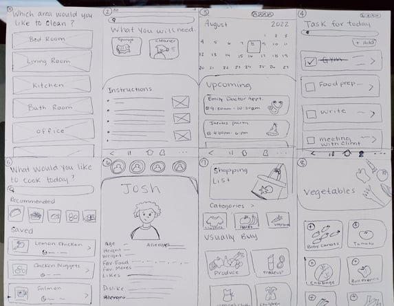
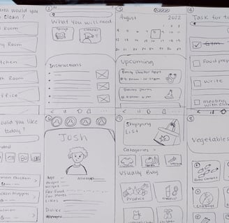
Upon compiling the "How Might We?" statements, I proceeded to brainstorm potential solutions. I began the ideation process with quick sketching, allowing my ideas to flow freely without setting any boundaries or limitations.
Once I had a collection of ideas, I reviewed them and identified the most promising ones. These were then developed into more detailed sketches and wireframes, which were evaluated further to determine their potential impact on the user experience.
User Stories
My goal was to develop solutions for the primary tasks that users would perform on the app. I identified the top tasks that I wanted users to be able to accomplish.
As a user, I want to...
As a user, I want to log in to add my child's appointment to the “shared calendar”, so that everyone in the family can see what we have scheduled for that day.
As a user, I want to know how to clean the kitchen properly, so that I can avoid getting any cross-contamination.
As a user, I want to keep up with things I need to do throughout the day so that I won't forget to do them later.
As a user, I want to save meal plans, so that I can spend less time thinking about what to cook.
As a user, I want to have my children's allergies list at hand, so that I don't get them confused with anybody else's.
With the help of the site map, I was able to restructure the app to make it more intuitive and user-friendly. I realized that the 'Chore Chart' and 'Family Page' were not necessary for users to complete their primary tasks. By removing these features, I was able to simplify the app and make it more streamlined, which would ultimately lead to a better user experience.
Additionally, the site map has allowed me to see the connections between different pages and how they relate to each other, which helped me to identify any gaps or inconsistencies in the user flow.
Sitemap
User Flows
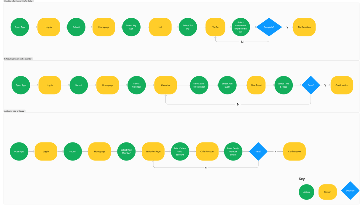
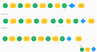
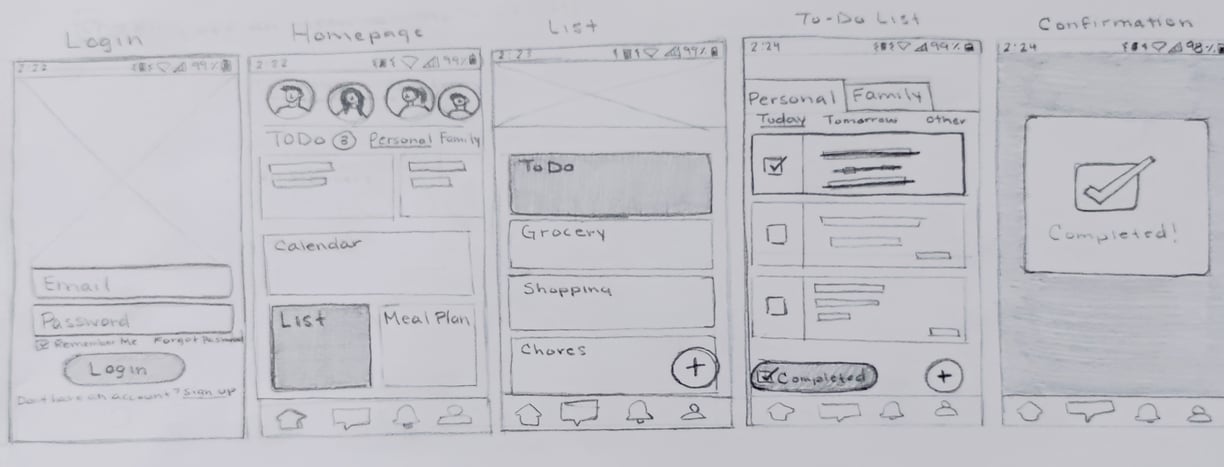
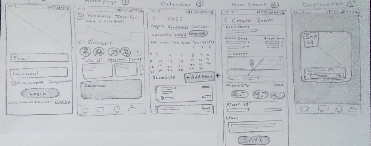
After finalizing the sitemap, I proceeded to create three distinct user flows that would address the identified problem statements. These user flows included every screen, action, and decision that the user would encounter while completing their tasks.
Scheduling an event on the calendar
Checking off an item on the To-Do list
Adding my child to the app
Sketching
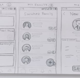
As I sketched out various design concepts, I constantly kept in mind the user's goals and pain points. I wanted to create a design that would make it easy for them to achieve their tasks and ultimately enhance their experience on the app. With each sketch, I refined my ideas and considered the potential challenges that the user might face. By the end of the sketching process, I had a range of design concepts that were both innovative and practical, and I was eager to move on to the next stage of the design process.

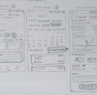
Wireframes
After sketching, I took my sketches to the next level by making them in Figma, turning them into the blueprint of my product. To begin, using basic shapes, icons, and placeholder text to represent different elements of the design, such as buttons, forms, and images. Throughout the wireframing process, I made sure to keep the user experience in mind and considered how each element of the design would contribute to the overall user flow. I also incorporated any feedback or insights gathered from user testing or from senior designer feedback to refine the wireframes and make them as effective and user-friendly as possible.
Creating these wireframes helped me see the overall design for each page. Additionally, I made changes to the design to be more user-friendly.
Design
Brand Personality
I embarked on the crucial task of infusing our product with a distinct brand identity that would resonate deeply with our target audience and inspire them to engage with our platform consistently. Understanding the importance of creating a compelling brand narrative, I meticulously crafted a brand platform that aimed to encapsulate the essence of our product's values and mission. Drawing inspiration from our users' needs and aspirations, I focused on developing a brand personality that exuded warmth, authenticity, and inclusivity. By prioritizing attributes such as supportiveness, meaningfulness, vibrancy, and connection, our brand platform was designed to foster a sense of belonging and empowerment among our users.
Through this strategic approach, we aimed to not only attract users but also to cultivate lasting relationships and drive sustained engagement with our platform.
Mood Board
For the Mood Board section of the FamJam project, I carefully curated a selection of images with the intention of effectively communicating the brand's values and personality to its users. Each image was chosen to evoke feelings of warmth, connection, and belonging, aligning with FamJam's friendly, family-oriented, and inviting message. By incorporating elements such as vibrant colors, happy faces, and inclusive settings, the mood board served as a visual representation of the brand's identity and helped guide the design direction for the project.
Through this thoughtful selection process, the mood board played a crucial role in setting the tone and establishing a cohesive visual language for FamJam's digital presence.
Style Guide
Next, I needed to develop a style guide. By establishing a clear set of guidelines for colors, typography, icons, and other design elements, I could ensure that the final product would have a cohesive and polished appearance.
I also wanted to make sure that the style reflected the brand personality that I had developed earlier. This meant that the colors and typography needed to be lively and engaging, while still being easy to read and navigate.
High Fidelity Screens
The focus was on creating a straightforward yet significant application that incorporates the latest Hi-Fi screens. For the design, I opted for a darker aesthetic and carefully chose colors that would inspire trust and positive emotions in users.
When creating the high-fidelity screens, I kept several elements from the wireframes, such as the overall layout and structure of each page, the placement of key design elements like buttons and forms, and the basic color scheme. However, I also made several adjustments and enhancements to the design.
I refined the typography and added more contrast to make the text easier to read.
I also added more visual elements, such as icons and images, to help guide users through the application and make the overall design more engaging.
I made sure to align the design with the latest design trends and best practices, such as incorporating white space and keeping the design minimalist to avoid overwhelming the user.
User Testing
Prototype
I utilized Figma to design a prototype of the key user flows (red routes). Despite facing several challenges, I made iterative improvements to get closer to my vision for the final product. I also identified areas where usability was lacking and made necessary enhancements to improve the overall user experience.
Usability Testing
To ensure that my app's flows were functional and intuitive, I conducted a usability test to identify any issues or confusion users may encounter while performing different tasks. I recruited 5 participants to test a prototype via Zoom and asked them to complete 3 specific tasks, carefully observing their interactions and collecting feedback.
Objective
Do users understand how to check off an item on the To-do list?
Are any challenges presented when users try to schedule an event?
Are users able to add/invite members to the app?
Are there any words or terminology that are unclear or unfamiliar to users?
Are there any unexpected roadblocks that stop users from easily using the application?
Scheduling an event on the calendar
Checking off items on the To-Do list
Adding my child to the app.
Task Questions
The conducted usability testing allowed me to assess the navigational abilities of users within my app, identifying areas of concern and gathering valuable insights to improve its functionality.
Test Results
Issue 1
Users were struggling to find the To-Do list.
The majority of users attempted to click on the 'Daily Task' section or 'Chore Chart' button rather than the 'List' button. Some users perceived it as an unnecessary step.
Recommendation: One suggestion I have is to remove both the 'Daily Task' and 'Chore Chart' sections altogether, as they can be confusing and redundant with the 'To-Do List' feature.
Issue 2
Issue 3
Some users would like to personalize (add a photo) the child's account while making or being on the account.
Some users found it difficult to locate the section where they could add an image or avatar for the child's account while filling out the information section. They felt that this feature was essential to complete the account.
Recommendation: Consider adding a dedicated section for users to upload a photo or create an avatar while creating a new account.
Users are thinking that the ‘List’ on the homepage is different from the ‘My List’ on the navigation bar.
Users expressed that they thought the two were different because the wording was different from one another.
Recommendation: Change the different wording to be the same. Users will know the two are the same.
Recommendation 2: Consider adding a dedicated section for users to upload a photo or create an avatar while creating a new account.
Redesign
After gathering feedback from all of the participants, I analyzed their responses and identified key areas where improvements could be made. I took their suggestions and incorporated them into my design process, making adjustments and redesigns where necessary. The goal was to create a final UI design that was not only visually appealing but also user-friendly and intuitive.
Reflection
Learnings
The complexity involved in creating a well-functioning app. Designing an app requires careful consideration of numerous factors, such as the various user journeys and potential issues that may arise during testing or development. Many of these factors may not even cross one's mind until the design process has commenced.
Incorporating additional design ideas. My ultimate goal is to create exceptional designs, but it is important to recognize that unnecessary additions can lead to confusion for users. By considering the user's perspective and thought process, I strive to strike a balance between creativity and simplicity. This ensures that the result is not overwhelming or confusing, but rather straightforward and seamless.
Keeping the design simple and seamless. The best approach is often to keep the design of an app simple and seamless. This enables users to navigate through the app with ease and complete their tasks without any distractions or confusion. Striking a balance between creativity and functionality is crucial, but prioritizing the user's needs and objectives is paramount.
Looking Forward
I am committed to staying up-to-date with the latest design trends and techniques and exploring creative solutions to address user needs effectively. My goal is to create products that offer unique and enjoyable experiences for users while remaining practical and functional.
I am excited about the opportunities that lie ahead and look forward to continuing to develop innovative design solutions that benefit users everywhere.


